The Eventbrite Mobile App
2024
Eventbrite’s mission is to bring people together through live experiences — and as the top platform in event management and ticketing, the stakes for getting the product right are high. In 2024, Eventbrite rebuilt its mobile app from the ground up, focused on delivering a platform for event discovery and social connection. The effort ran across three concurrent tracks: a complete brand redesign, a product and design system overhaul, and a rebuild of the native apps in React Native for iOS and Android.
We partnered with two design agencies — Buck, who delivered the refreshed brand design language, and Instrument, who helped translate that brand into the broad strokes of product design and system foundations. Our internal Eventbrite team included four to six designers at various points of the project, with a core team of three focused on systems and QA. Product development was distributed across multiple engineering teams, with the App Experience team as our primary partner in implementing the system.
I led two key areas of the design process: product design for event discovery, and design system architecture. On the product side, I designed the core discovery experience — home feed, search, and filtering — through wireframes, user testing, and high-fidelity visual design. On the systems side, I built the design token foundations, crafted a library of over 200 product UI icons, and contributed to a library of over 80 Figma components. Working alongside engineering, I also established the visual QA processes that elevated product quality through development and delivery.
Details
Role: Design Systems Lead, Product Design Lead (Discovery and Search), Visual QA Lead
Timeline: March 2024–December 2024 (9 months); total project timeline: January 2024–March 2025
Platforms: iOS, Android (React Native)
Team: 4-6 product designers, 1 design operations manager, 4-6 engineering teams, 2 agency partners
KEY DELIVERABLES
400+ primitive tokens (color, size, typography)
100+ semantic color tokens (light/dark modes)
200+ product icons
~80 Figma components
Product flows: search, browse/filter, home feed
Visual QA process and tracking dashboard
IMPACT
+5% paid ticket conversion rate
Foundation for Marmalade Gen. 3 design system for web
A new mobile app experience
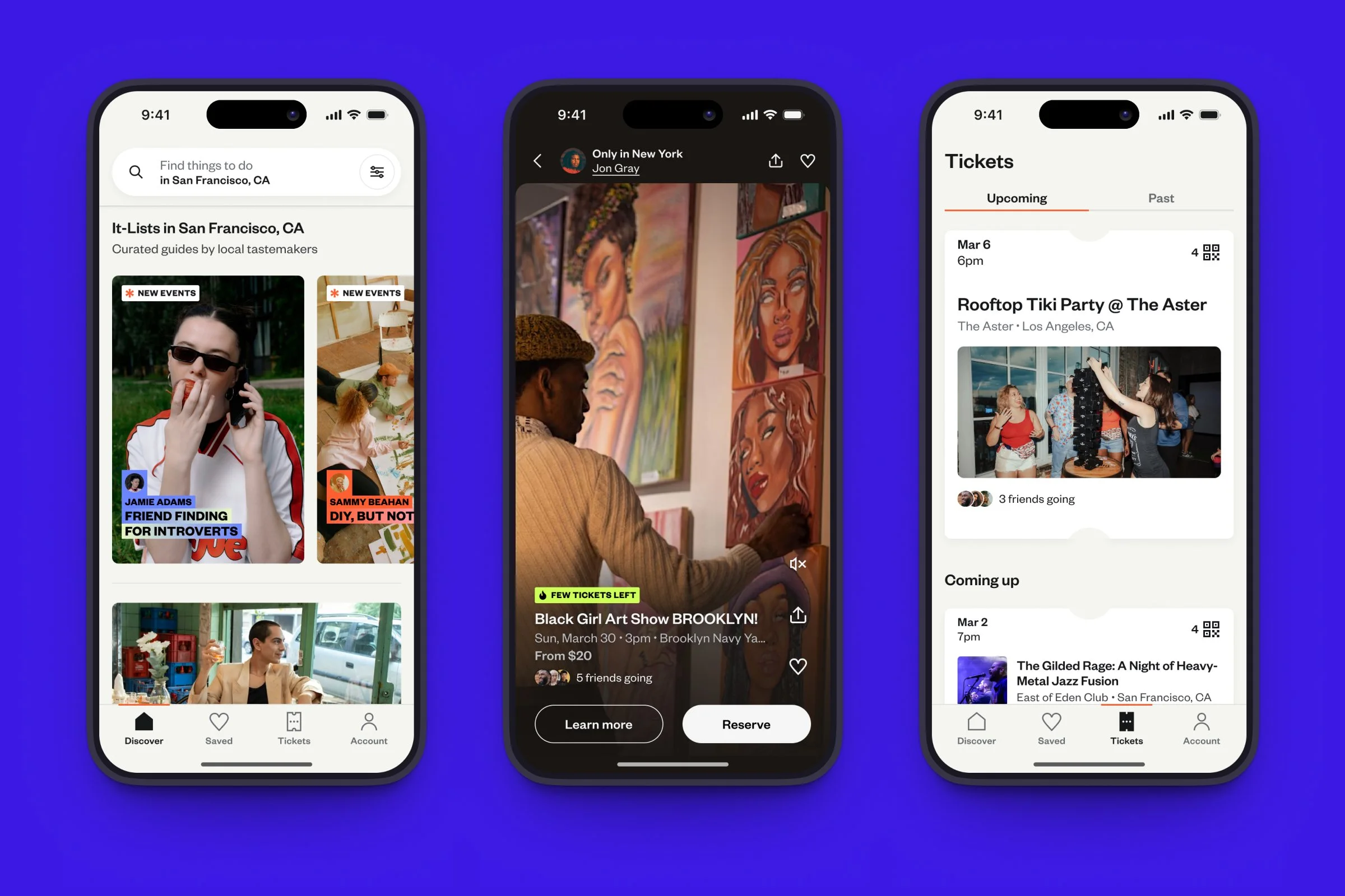
I joined Eventbrite in late 2023 as the principal product designer for consumer experiences, owning the app and web home feeds, search, and browse experiences. When the mobile redesign launched as a parallel effort in early 2024, I joined that workstream to carry those same features forward — bringing continuity of product thinking into the new platform.
I started with lightweight wireframes and prototypes, iterating through five to six rounds of design and user testing to shape the search and browse experiences. Search became a modal-based flow designed to feel natural for mobile interaction while allowing quick pivots between searching and browsing — a pattern that had to work across a wide range of user intents, from specific event lookup to open-ended exploration.
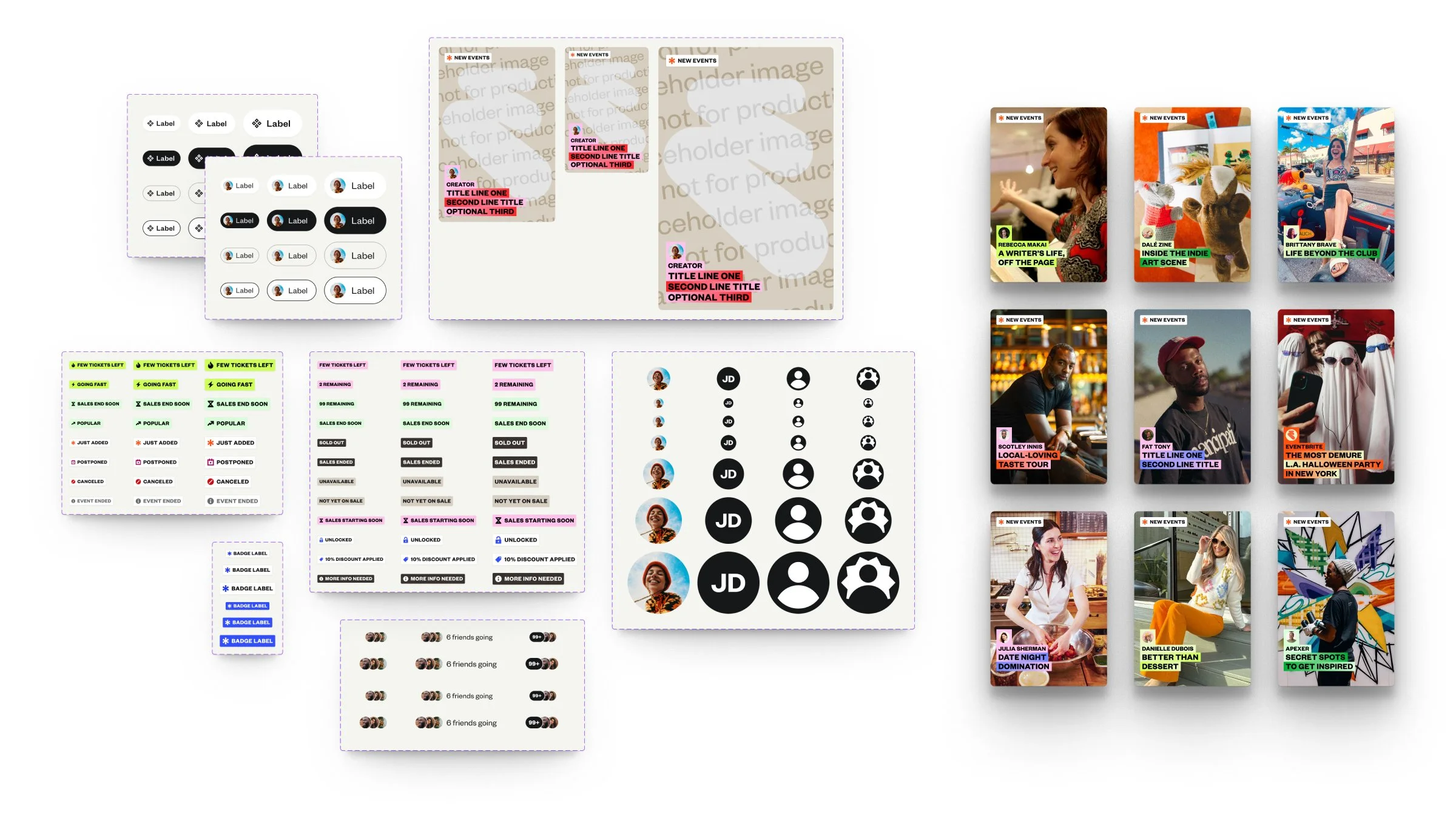
Event cards were a critical pattern throughout the product, appearing in the home feed, search results, and within event listings. The design challenge was real: cards needed to convey enough detail for consumers evaluating events while remaining concise and scannable. I designed a flexible system that could accommodate different event types — in-person, online, free, and paid — while supporting a wide range of content: images, videos, carousels, promotional badges and labels, and variable text detail. Getting this right wasn’t just a visual problem; it was a systems problem, and the decisions made here directly informed the component and token architecture built to support it.
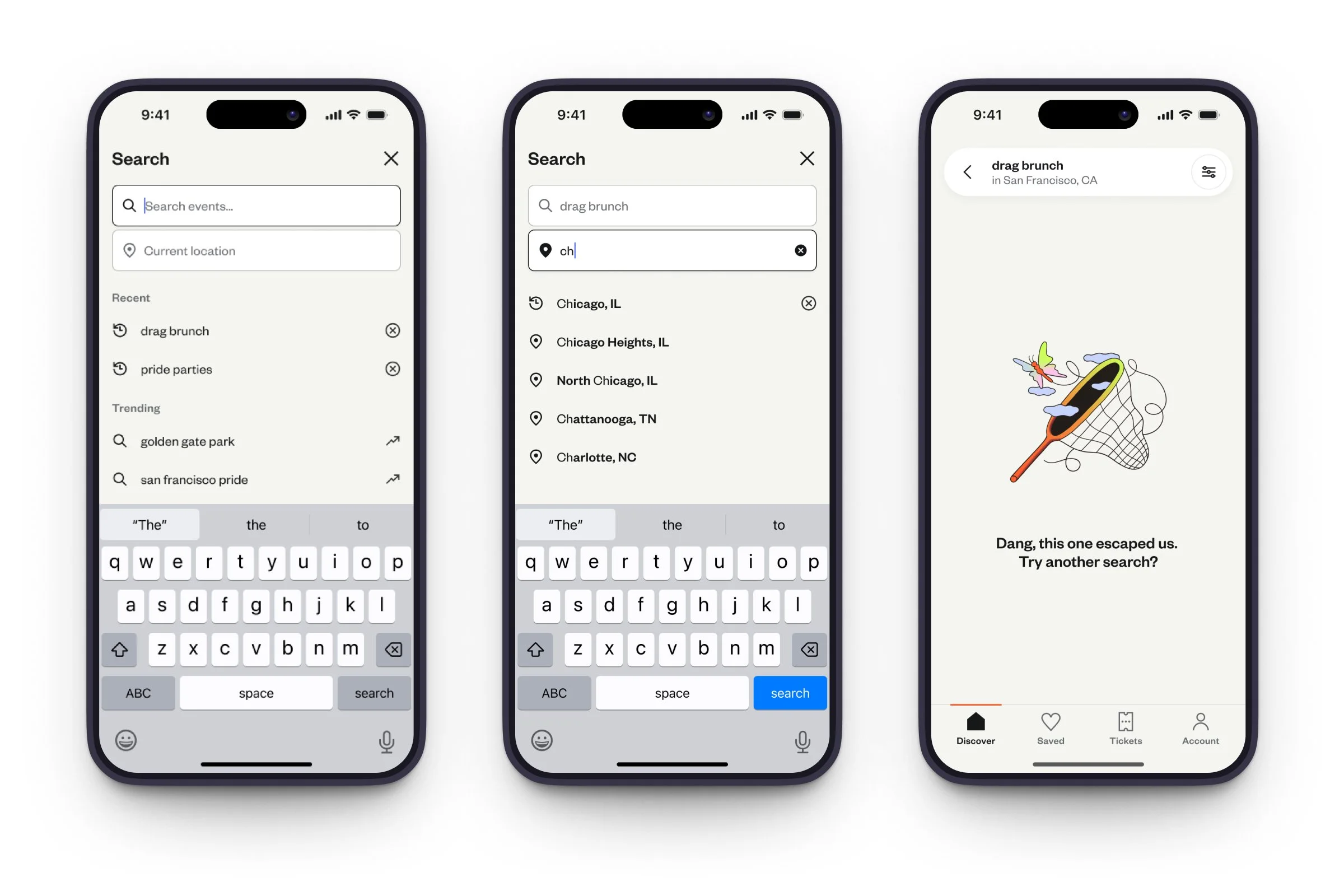
A modal search flow allows attendees to find specific events and set their location.
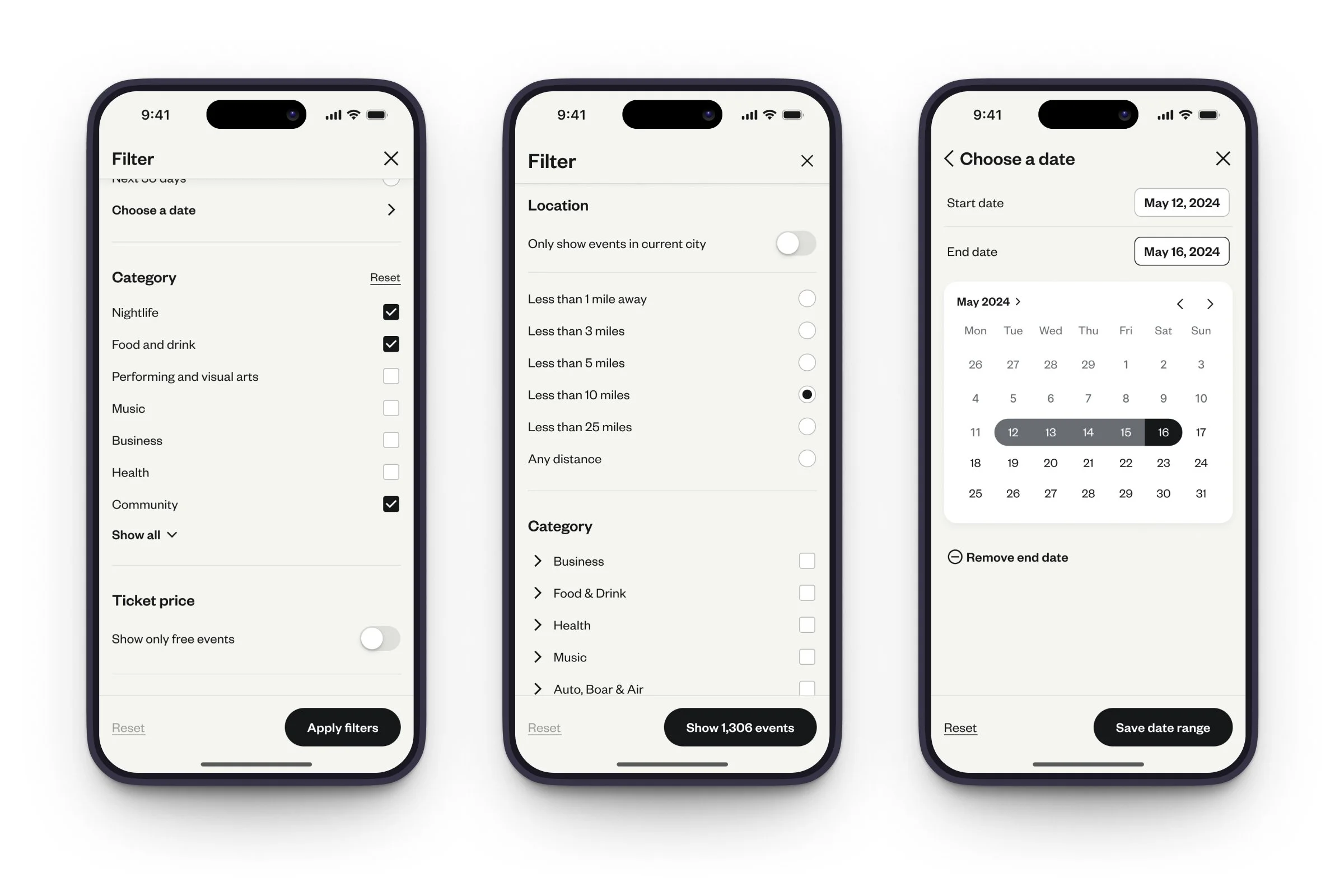
Attendees can also browse by filtering, with category, venue distance, and date ranges.
New app, new design system
As we rebuilt the app in React Native, we were able to implement a generational evolution of our mobile design system. Our agency partners helped establish the broad strokes of the brand and product design language — brand guidelines, initial components and patterns. Then, we expanded on this work, building a new design token architecture, icon system, and comprehensive component library.
Design Tokens
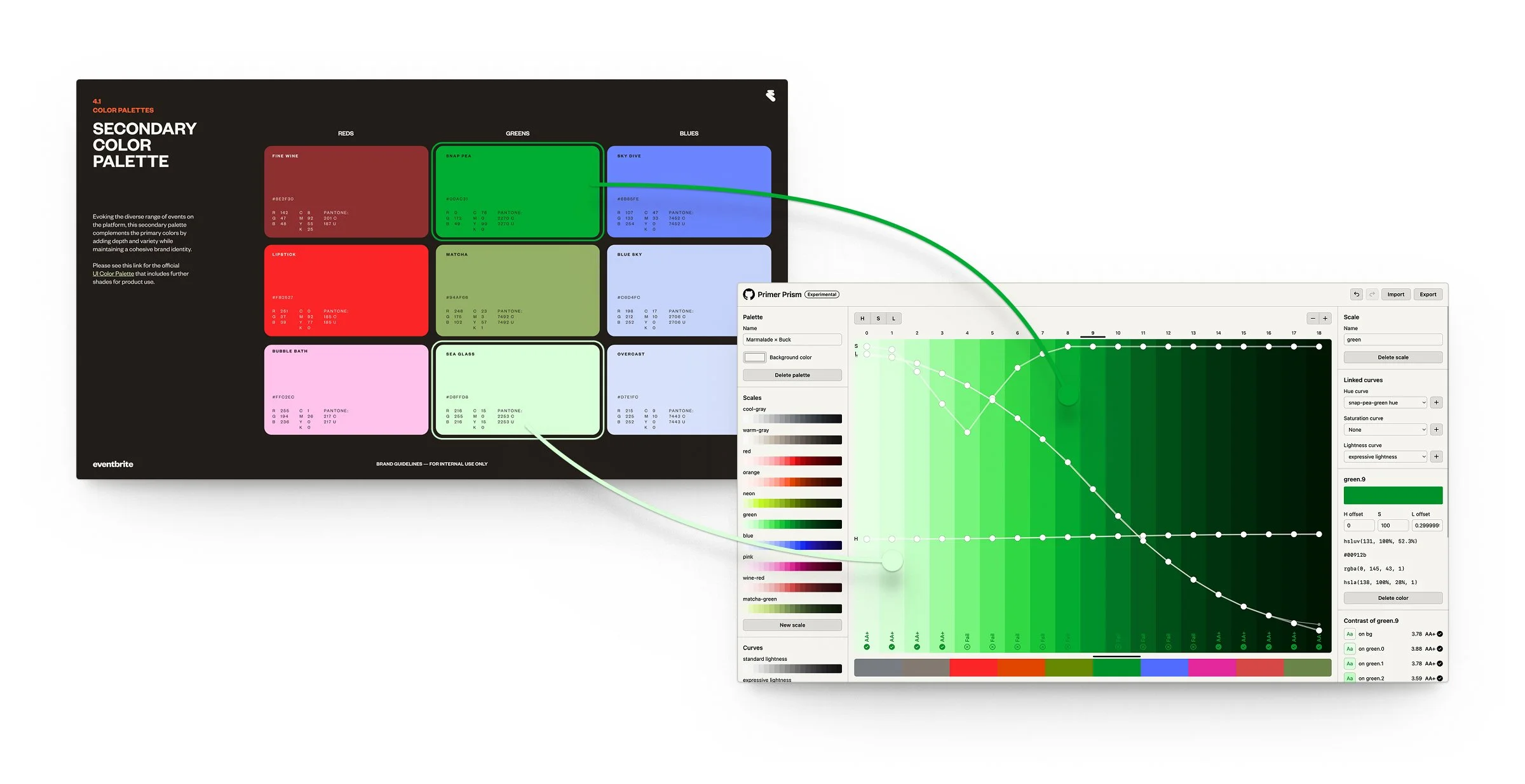
The token architecture I built for mobile followed a three-tier structure: global values at the base, semantic decisions in the middle, and component-specific tokens at the surface. The semantic layer was where most of the meaningful work happened — mapping raw values to their intended use in ways that would remain stable even as the brand or theme evolved beneath them.
One of the more consequential decisions was how to handle the relationship between the brand refresh and the token system. Rather than treating them as sequential — first the brand, then the tokens — I worked to develop them together, so the token layer could absorb brand changes without requiring downstream updates to every component. This meant defining the semantic vocabulary carefully upfront: not just “primary color” but the full set of roles that color would play across states, surfaces, and interactive elements.
Icons
The mobile redesign required a comprehensive icon set that matched the new visual direction. I worked through icon design at scale — establishing the grid, stroke weight, corner radius, and optical correction principles that would keep the set visually consistent across sizes and contexts. Beyond the individual icons, I defined the contribution and maintenance model so the icon library could grow without losing coherence.
Components
Component work on mobile introduced constraints that web doesn’t have to the same degree: touch targets, platform conventions, performance considerations, and the need to design for both iOS and Android while maintaining brand consistency. I built out the core component set with these constraints baked in, documenting not just the visual specs but the behavioral logic — states, variants, and the decision rules for when to use what.
In aligning the mobile design language with our existing web product, we had to make several compromises to ensure our event creators got the best representation of their events on all platforms. Here, we’re exploring image cropping and resizing; event images are 2×1, but may appear cropped in certain contexts, and a future vision for the mobile app included full-bleed 1×1 images.
Where possible, I aligned mobile component patterns with the broader Eventbrite design system to reduce the cognitive overhead for designers and engineers moving between platforms. This wasn’t always a 1:1 mapping — mobile has its own needs — but the shared token foundation meant that brand-level decisions propagated consistently across both.
Delivery and QA
Getting designs into production accurately is one of the places where design systems work pays off most visibly — or where its absence becomes most painful. I established a visual QA process for the mobile redesign that gave engineering clear references and gave design a structured way to catch drift before it shipped.
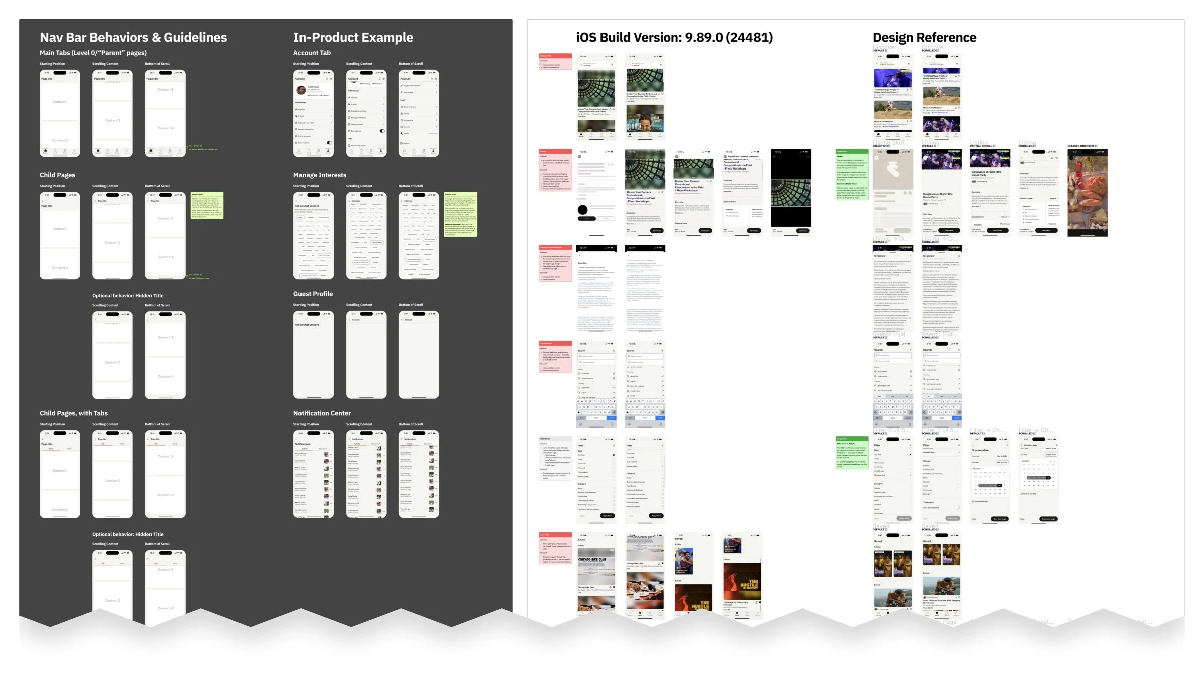
The process centered on direct comparison between design specs and implemented screens, working through a defined checklist of the highest-leverage details: typography scale, spacing, color accuracy, interactive states, and edge cases like truncation and empty states. Rather than treating QA as a handoff-and-check activity, I worked closely with engineers during implementation — answering questions early, flagging ambiguities in specs before they became bugs, and in some cases updating documentation based on what the QA process revealed.
This feedback loop between QA and documentation was intentional. Every issue caught during review was an opportunity to make the spec clearer so the same question wouldn’t come up twice.
Impact and outcome
The redesign shipped a substantially improved mobile experience with a visual language that held together across flows in a way the previous app hadn’t. But the more durable outcome was the infrastructure left behind.
The token layer built for this project gave mobile design a stable, maintainable foundation — one that future designers could build on without reverse-engineering undocumented decisions. The component library reduced the design-to-build time on new features by giving engineering a set of well-documented, production-tested patterns to work from. And the visual QA process created a shared standard for what “done” meant between design and engineering, reducing the back-and-forth that had previously eaten time at the end of every release cycle.
The systems work done here also fed directly into the larger Marmalade Gen. 3 design system effort — the token architecture, component patterns, and infrastructure thinking established on mobile became part of the broader organizational foundation.