Eventbrite Marmalade Design System
2025
Marmalade is Eventbrite’s design system for web products — the foundation used by product teams across the organization to build consistent, scalable UI. By 2024, the system was showing its age in three significant ways. The new brand design language that had been developed for the mobile app existed only there and in isolated marketing pages; it had never been brought into the web product layer. The existing Marmalade system had no meaningful token architecture — no semantic layer, just primitives and hard-coded values scattered across components. And the React component library had accumulated years of debt without active maintainers or a clear process for bug fixes and feature additions.
Marmalade Gen 3 was the effort to address all three problems at once: bring the brand to web, build a proper token foundation, and modernize the component library with sustainable architecture for ongoing growth. Critically, we made a deliberate shift in how we thought about the system’s consumers. Engineering was the primary audience — the Figma resources existed to support and align with the codebase, not the other way around. That reorientation shaped every decision we made.
I was the primary design architect of Gen 3. I designed and implemented the token system end-to-end on the design side, and partnered closely with our lead engineer to build the code-side token pipeline. I owned the component library rearchitecture — designing all new components and component archetypes, and delivering Figma components and implementation specs for the development team. Because we were upgrading existing components rather than building in isolation, the work required sustained back-and-forth with engineering on property architecture, API changes, and backward compatibility.
Details
Role: Principal Designer, Design Systems Architect
Timeline: January 2025 to November 2025
Team: 2-4 designers, 1-2 engineers (varying over the course of the project)
Early adopters: Marketing team (landing pages), Listings team (consumer product)
KEY DELIVERABLES
Design token system: 400+ tokens, two brand themes, four color modes
Token pipeline: JSON → Style Dictionary
Component archetypes
15 React components refactored with design token support (themeable, responsive)
Documentation: token guidelines (for customers and maintainers), component specs for engineering, migration guides for adopters
Key Features
Multi-brand theme support, compatible with legacy Marmalade design language and refreshed brand design language
Color mode support: light, dark, and high-contrast variants of each
Unified responsive sizing with an enforced 2-breakpoint system
Backward compatibility and zero breaking changes for teams adopting the upgraded design system
Building the foundations
The token system was the foundation everything else depended on, and it was the most technically complex part of the project. The existing system had none of it — no semantic layer, no structured relationship between raw values and their intended use. Building that from scratch meant making consequential architectural decisions upfront that would have long downstream effects.
I designed a multi-tier token architecture covering four major dimensions: multi-brand theming, color modes, responsive sizing, and component-level tokens through a component archetype model.
Multi-brand and color mode support was handled primarily through the semantic token layer. Rather than mapping component styles directly to primitive values, semantic tokens define the roles that values play in the UI—surface colors, foreground colors, border treatments, interactive states—and each brand theme provides its own mapping of those roles to primitives. A color mode or brand switch propagates through the system by swapping the semantic layer’s mappings, without touching individual components.
Where the two brand themes diverged significantly in ways semantic tokens couldn’t accommodate, I introduced a downstream element token layer scoped to specific UI patterns. The Button component is a clear example: most of its design — spacing, child element sizing, responsive behaviors — is handled by universal semantic tokens shared across themes. But corner radius and color logic required element tokens, because the differences were too significant for a single semantic mapping to cover. The new brand uses pill-shaped buttons with a monochromatic color scheme; the legacy EDS brand uses rounded rectangles with distinct colors for primary, secondary, and tertiary buttons (orange, gray, and blue). Element tokens let each theme express those differences without duplicating the rest of the component’s token usage or introducing conditional logic into the component itself.
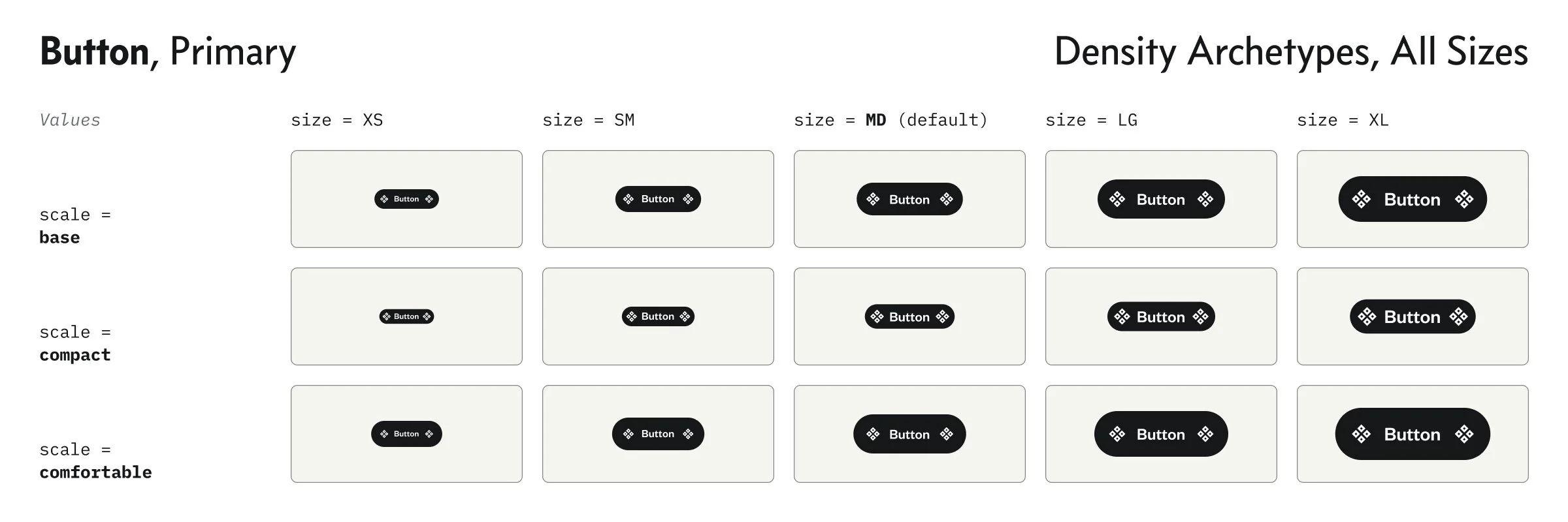
Responsive sizing introduced a token dimension that the previous system had no concept of. Rather than fixed values at every scale point, I designed a responsive token layer that allowed spacing, sizing, and typography to adapt across breakpoints through structured token references — keeping the design system in sync with how the codebase handled responsive behavior.
Component archetype tokens were the bridge between the semantic token layer and the component library. Rather than giving every component its own isolated token set, I defined a set of archetypes — recurring component patterns like interactive controls, surfaces, and containers — each with a shared token vocabulary. Components that share an archetype inherit a consistent token structure, which reduces redundancy, makes the system easier to reason about, and ensures that brand or theme changes propagate predictably across related components.
Keeping design and code in-sync
One of the most important infrastructure decisions in Gen 3 was establishing a proper design-to-code token pipeline — something the previous system entirely lacked. I partnered with our lead engineer to build a pipeline using Tokens Studio for token authoring in Figma and Style Dictionary for transformation and distribution to the codebase.
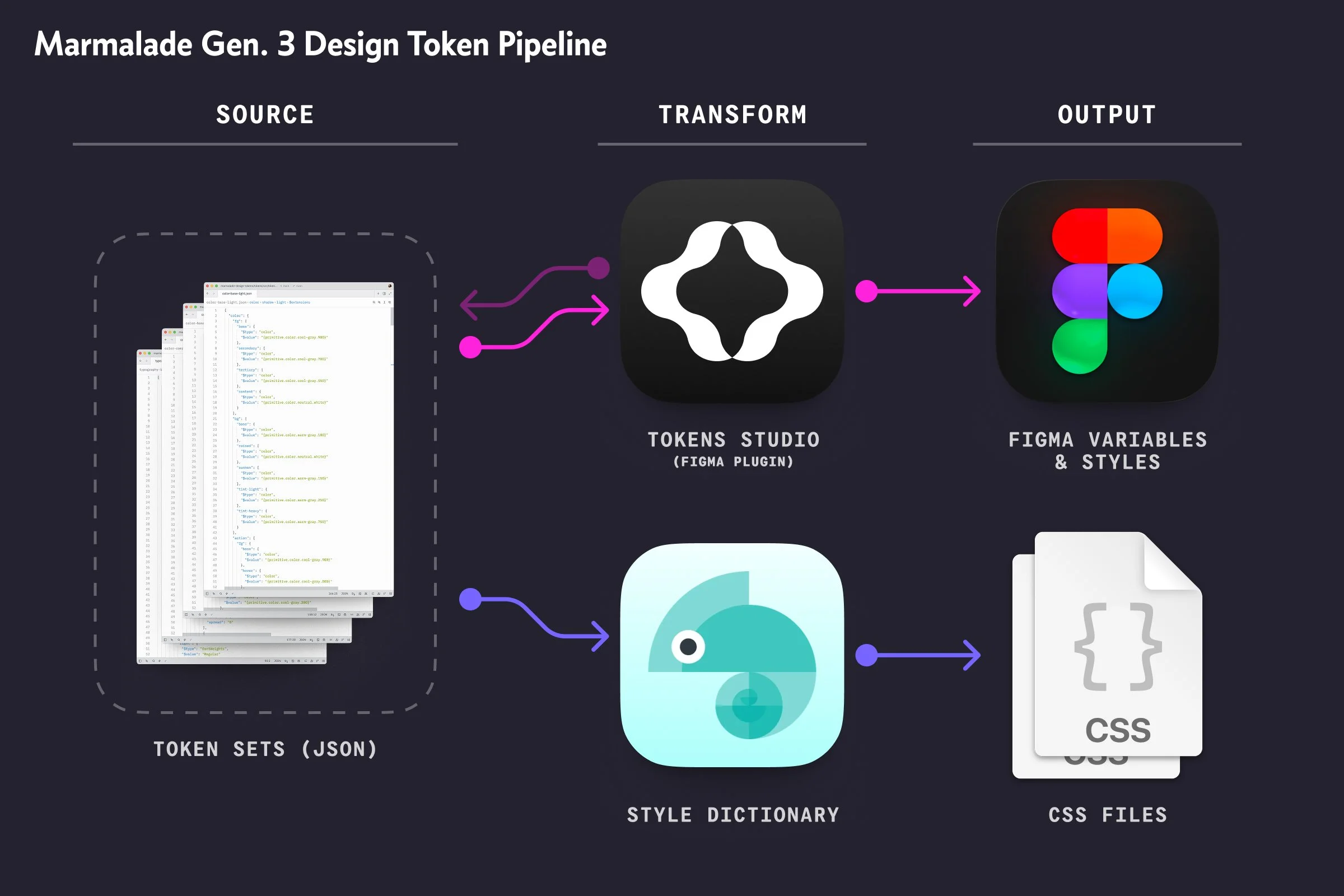
This meant tokens had a single source of truth that both design and engineering worked from. Changes made in the token system propagated through the pipeline to code, eliminating the manual translation layer that had previously introduced drift between design specs and implementation. The pipeline also enabled the multi-brand and color mode architecture to function at the code level — not just as a Figma feature, but as a real, usable system for engineering teams building product.
The shift to engineering as the primary system consumer made the pipeline investment especially important. The goal wasn’t just design consistency — it was giving engineering a reliable, well-structured token API they could build against with confidence.
Iterating with partner teams
Tokens and components were deliberately sequential, not parallel. We established and validated the token system first, then expanded and scaled it as we moved into component design and development. That sequencing mattered: it meant component work could be built on a stable token foundation rather than having both layers evolve simultaneously and create compounding instability.
The token architecture didn’t ship in isolation — we validated it through a real product context from the start. Our first early-adopter partner was the Marketing team, who were building a new Landing Page toolkit for publishing modular content pages. They became our test case for the token system before component work had begun, which was exactly the right kind of stress test: a team with real production needs, working directly from the token layer without a component library to lean on. Their feedback shaped how we refined the semantic layer and surfaced edge cases we wouldn’t have found internally.
When we moved into the component phase, we brought on the Listings team as our early-adopter partner. They adopted our in-development components as we built them, using them in real product work and surfacing issues that internal review alone wouldn’t have caught. The Listings partnership was particularly valuable for the responsive sizing tokens — seeing how those tokens behaved across the range of contexts the Listings experience required gave us confidence in the architecture and revealed specific gaps we needed to close before broader rollout.
This partner model — real teams, real product contexts, incremental adoption — gave Gen 3 a validation layer that made the eventual broader rollout significantly lower risk.
Evolving components across design and code
The component library work followed the token foundation, and the two were deeply interdependent. Every component decision had token implications, and the token architecture — already validated through the Marketing and Listings partnerships — shaped what was possible at the component level. The Listings team’s continued involvement during component development meant we had an external perspective throughout: real product engineers pushing on API decisions, surfacing edge cases, and helping us understand where the system was working and where it needed more definition.
I redesigned the component library from the ground up, with the component archetype model as the organizing principle. Each archetype defined not just visual patterns but the underlying property architecture — the set of configurable properties, their allowed values, and the token references that drove their visual output. This gave engineering a predictable, consistent API across component families, and gave designers a coherent mental model for how the system fit together.
Because we were upgrading existing components rather than building in isolation, every component went through a structured iteration process with engineering. API changes required careful negotiation between design intent and backward compatibility constraints. We established a review process that moved components through defined stages — from archetype definition through design spec to implementation review — with explicit sign-off at each stage before moving forward. This replaced the informal, ad hoc process that had left the previous library without active maintenance.
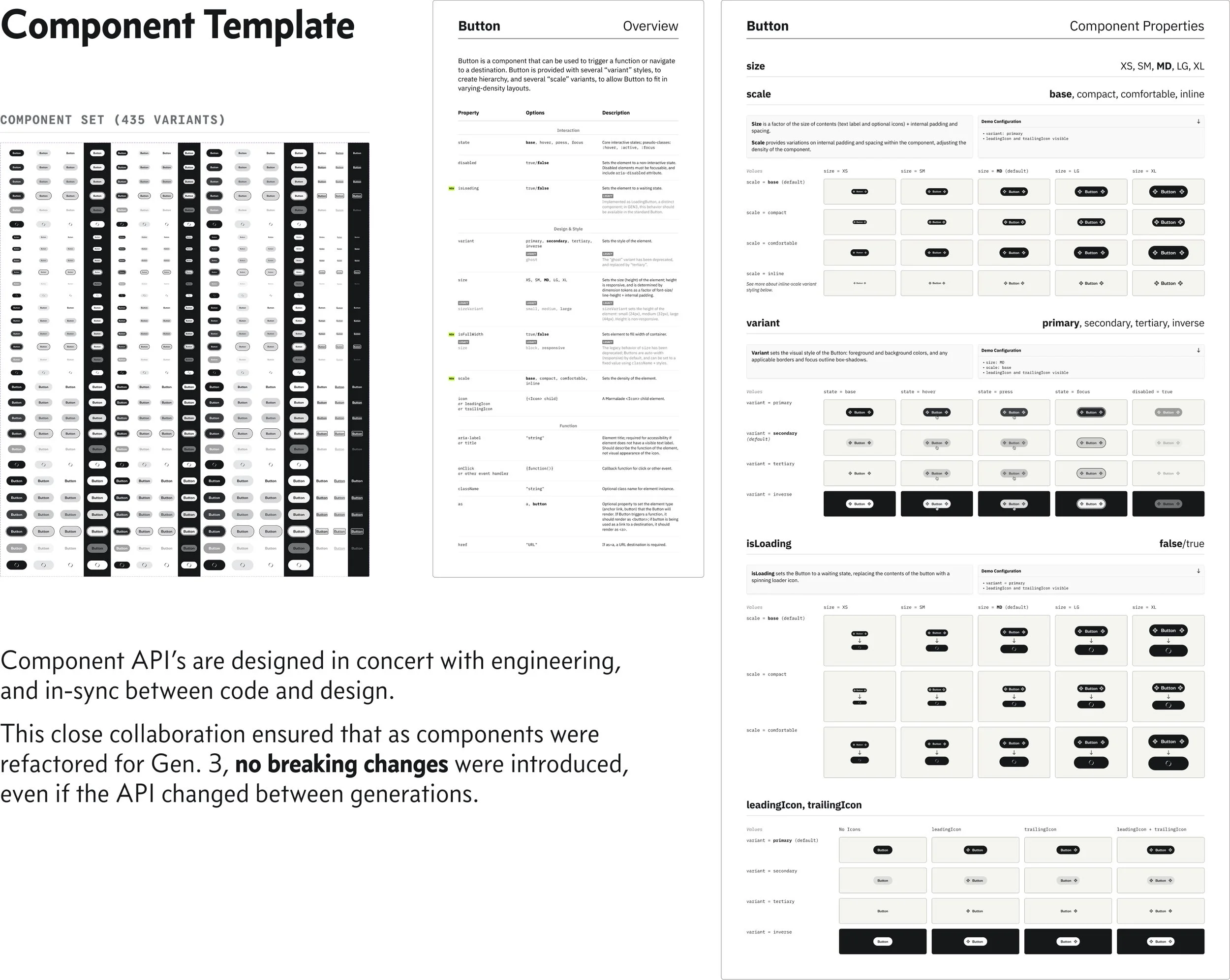
The Figma component library was built to mirror the codebase: same component names, same property architecture, same variant structure. The goal was to make the Figma library a genuine design-side reflection of the React library, so that a designer working in Figma and an engineer working in code were reasoning about the same system.
Impact and outcome
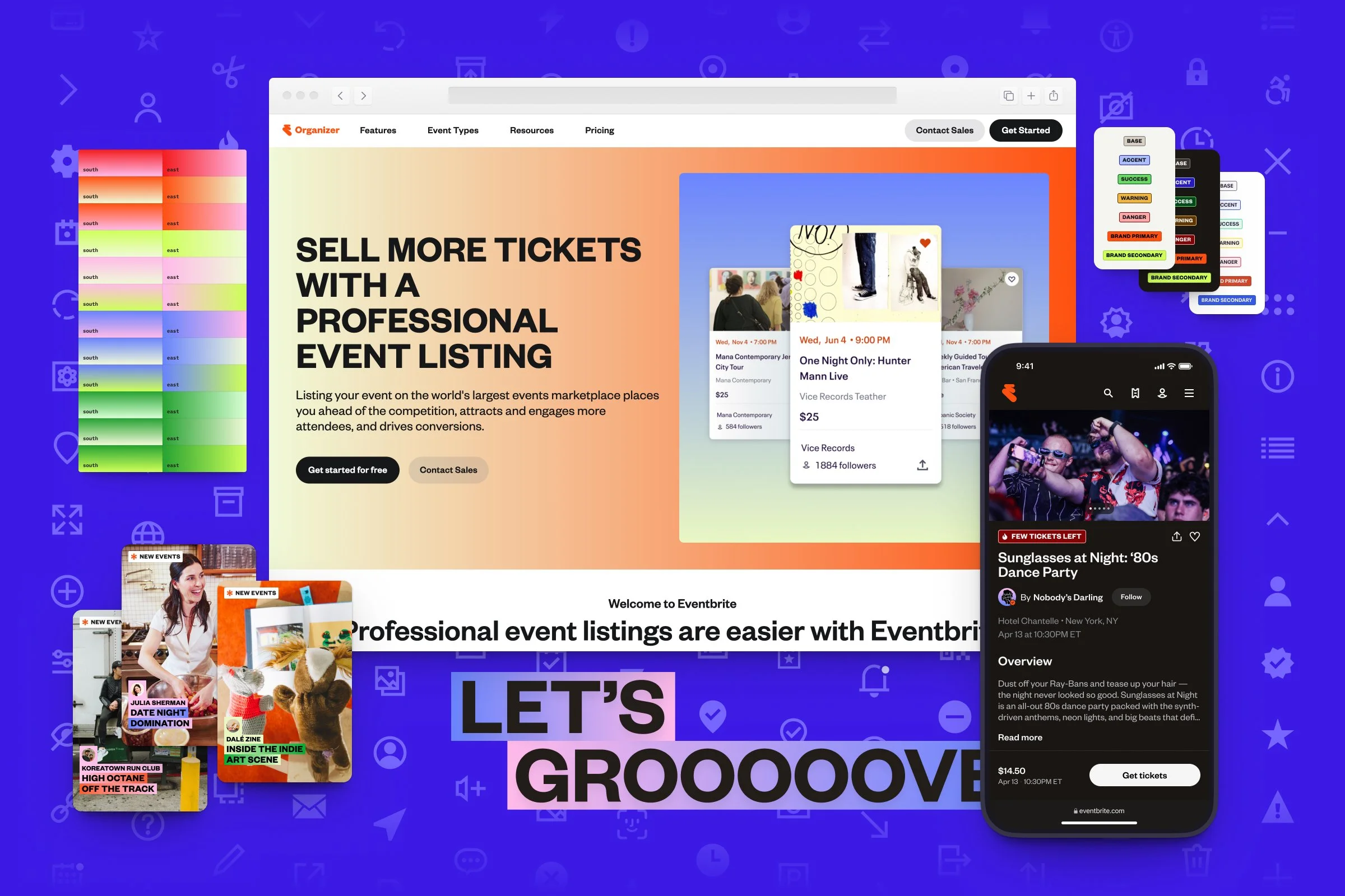
Gen 3 delivered what the previous version of Marmalade never had: a token-driven, multi-brand-capable design system with a real pipeline between design and code. The brand design language reached web products for the first time, giving Eventbrite a consistent visual identity across its full product surface.
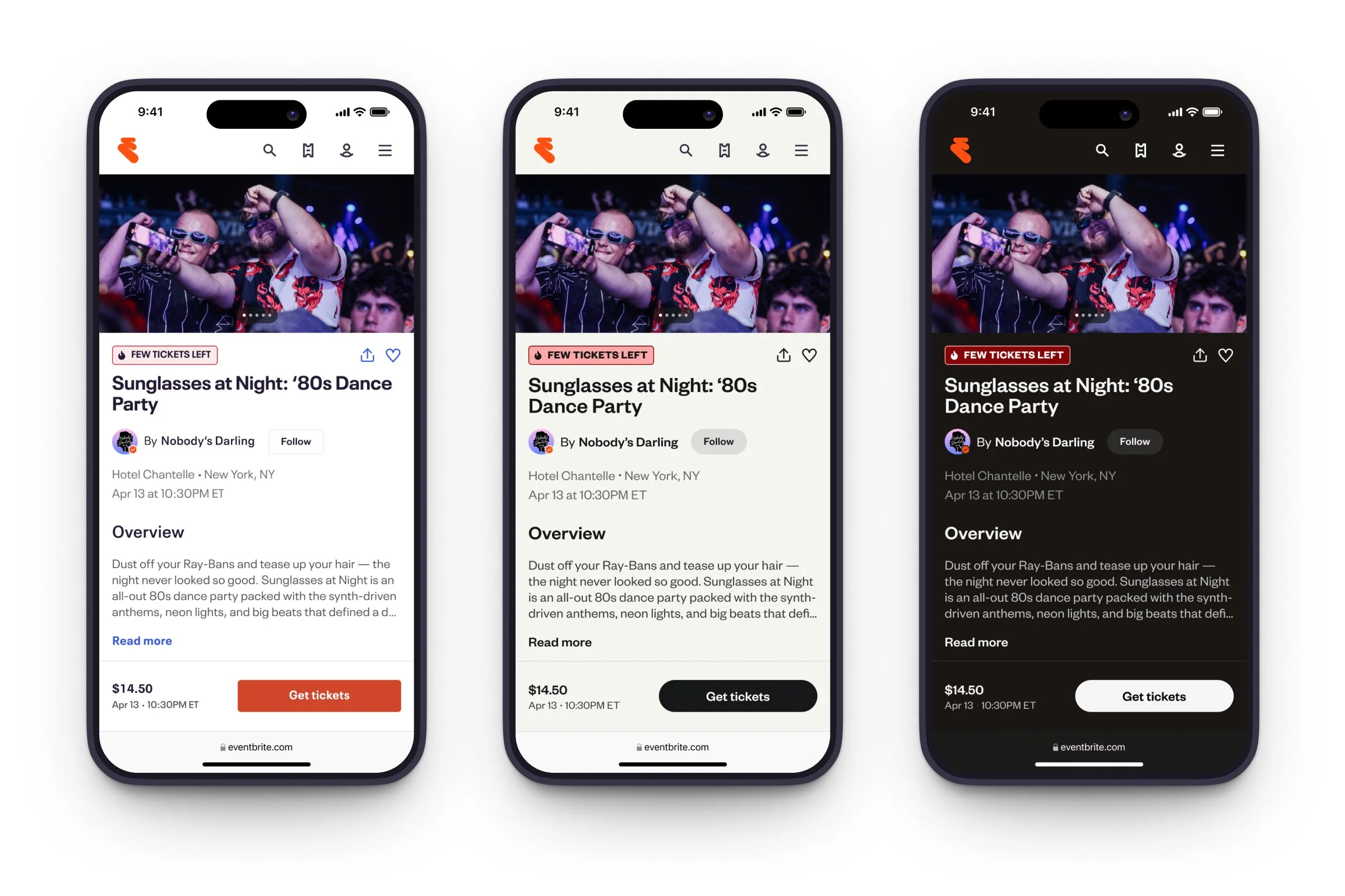
A demonstration of the brand themes and color modes in action: the redesigned Event Listing on mobile web, illustrating how the refreshed Eventbrite brand would be rolled-out across the web by leveraging the power of the token system.
The token architecture gave engineering a stable, well-structured foundation to build from — one that could accommodate brand evolution, new themes, and color modes without requiring component-level changes. The component archetype model reduced the complexity of the library while increasing its coverage, and the pipeline infrastructure meant that design and engineering were genuinely working from the same source of truth for the first time.
The partner adoption model proved its value beyond the project itself. By the time Gen 3 reached broader rollout, it had already been tested in production by real product teams — which meant fewer surprises, faster adoption, and a system that had been shaped by actual use rather than internal assumptions alone.
Perhaps as importantly, the project established process where there had been none. The component review workflow, the token pipeline, and the engineering-first orientation gave the system a maintenance model it could actually sustain — making Gen 3 not just a better system than its predecessor, but a system that could keep getting better.