
The Keller Williams
Experience Design System
2020–2023
The Keller Williams Experience Design System, or “KWXDS”, is the family of design systems used by all digital products from KW. These products include: KW Command, our agent-oriented CRM, marketing, and business management software; KW Connect, our internal training and community development platform for agents and associates; and KW.com and the KW mobile app, our consumer-oriented real estate search product.
KWXDS is a system of systems, individual design systems for distinct audiences and products built on a shared foundation. Each area of KWXDS contains resources and documentation for designers and engineers, including Figma libraries, style guides, component libraries for engineering, and tools for design and development.
I served as the design and product owner of KWXDS, fulfilling many roles over the lifetime of the project: principal designer, design and engineering manager, project manager, design operations lead, QA tester, customer support rep, design system evangelist… you name it, I did it (or I found someone to do it better). Throughout the project, I built a team of designers, engineers, and contributors, and established a governing body to ensure the health and continued growth of the system.
At the time I left Keller Williams, KWXDS had been adopted by every one of our product development teams, and we were leveraging this enthusiasm to increase user contributions and grow the system’s resources. Two distinct design systems had been built within the system, and a third was in development, serving our Brand, Marketing, and Communications team.
Timeline
Phase 1 (The Agent Design System)
Late 2019–Spring 2020
Phase 2 (Design System Development and Adoption)
Summer 2020–Spring 2022
Phase 3 (The Consumer Design System & KWXDS Foundations)
Summer 2022–Spring 2023
Team
Principal Designer & Design Systems Manager
Design Lead (Agent System)
Front-End Engineering Lead
Engineering Architect
Role
Principal Designer & Design Systems Manager
Background
I joined Keller Williams in the spring of 2019 as a Senior Product Designer on the Command team, focused on our marketing and lead generation products, Campaigns and Designs.
Working with the team on these products helped me become familiar with the state of design systems at KW, known as the REAL UI Kit.
The REAL UI Kit
The REAL UI Kit was a rudimentary custom-built design system, developed by a very small team over a short engagement (3-4 months) in 2018. It included a style guide/documentation (as an InVision prototype), a series of Sketch symbol libraries (managed in Abstract), and a React component library for web development with its own documentation site.
The technology team at Keller Williams was a small team with a big appetite; their mission was to transform from a legacy real estate brokerage into a tech company, unlocking the potential of their agents through bespoke tools and products to help them run their businesses. To achieve this mission, the team needed to move quickly and broadly, building many products and features across a range of business areas.
An Opportunity for Improvement
In mid-2019, there were several key initiatives in flight across the technology department. The first: building to a general-availability release of Command at KW’s annual MegaCamp agent conference in August. The second: development of a brand-new Consumer-oriented real estate buying and selling platform, similar to Zillow or Redfin, for release in early 2020. There were also several smaller product streams in progress, including a reimagined mobile app companion to Command, and a new platform for market center associates, the offices and staff that support and enable agent teams. While the core Agent-oriented web products were built using the REAL UI Kit, the new Command Mobile app and the Consumer platform designs were a significant departure from the existing style guide.
I began interviewing designers, engineers, and stakeholders across the product leadership team to gather insights about the existing design system and these newer explorations, and several key themes emerged:
The REAL UI Kit was too limited and inflexible. Designers couldn’t configure components to fit their needs, so they would design custom solutions. Engineers frequently encountered limitations in the React components, so they would build their own versions of components.
The libraries were hard to manage and update. Without a dedicated owner or team, we had no process in place for accepting and implementing improvements to the system, or verifying new features for quality and functionality. Management of the Sketch symbol libraries was shared among designers, and the React library was built as a monorepo with a single package, meaning that any individual component updates required teams to update the entire library in their codebase.
Accessibility was an afterthought. A limited palette of colors in mostly lighter, pastel shades resulted in numerous color contrast issues across the system. Components were seldom tested with keyboard or screen reader navigation, and ARIA attributes and titles were often ignored or difficult for end-users to implement.
The visual style felt dated, heavy, and dull. Newer products, like the Consumer platform, adopted a completely distinct design style, and across the team designers were experimenting with tweaks to the visual design language: inconsistent icons, bolder use of color, gradient effects and shadows, etc. These newer experiments were well-received by the executive team, so designers continued to break out of the existing style guide.
Setting Goals for the Design System
To support our design and engineering teams, it was clear that we needed to revisit our design systems and implement a series of improvements. Working with stakeholders from design and engineering, we defined these goals for the design system:
The design system is a product, and needs a product team behind it. We would establish a team responsible for ensuring the health of our design system resources; even if not full-time, they would be in charge of accepting and implementing new features and fixes.
Design system libraries should be built on a modern architecture. React components would be individually packaged and versioned to streamline adoption. Design libraries would be optimized for our design workflows; though we didn’t know it just yet, this would lead to the team-wide adoption of Figma to replace our Sketch + InVision + Abstract tooling stack.
Accessible design and development would be required. Color contrast issues should never occur; components would have required attributes for accessible labeling and implementation.
The visual design look-and-feel should be fresh, yet familiar. We intended to update the design system incrementally, so new components would need to live alongside older ones without conflict.
Components should be highly flexible and customizable. Designers and engineers wanted the freedom to customize their interfaces to the needs of their product, and the system should account for these needs at the component level.
With initial goals in place, I began design work on the next evolution of our Agent-oriented design system in the fall of 2019.
Design Language Evolution

Version 1, the REAL UI Kit. 2018–2019.

Version 2, the Agent design system. 2020–2022.

Version 3, the Consumer design system. 2023.
KWXDS went through two distinct evolutions during my time at Keller Williams. When I joined KW in 2019, the design team had a utilitarian library of components and style guides, known as the REAL UI Kit, and which I’ll refer to here as “Version 1”.
In late 2019, I began work on “Version 2” of the design system: an evolution of the REAL UI Kit for Agent-facing products, like the Command CRM platform. Initial design for V2 was completed by the summer of 2020, and I managed the engineering implementation of the system and adoption by the design and product development teams.
In the spring of 2022, I began work on “Version 3”: a new design language for KW Consumer products like KW.com, and a new global foundation for the design systems, XDS Base.
A System of Systems
KWXDS is a “system of systems” — multiple design systems, each with their own visual design language, built on a shared foundation of design tokens, icons, and themes.
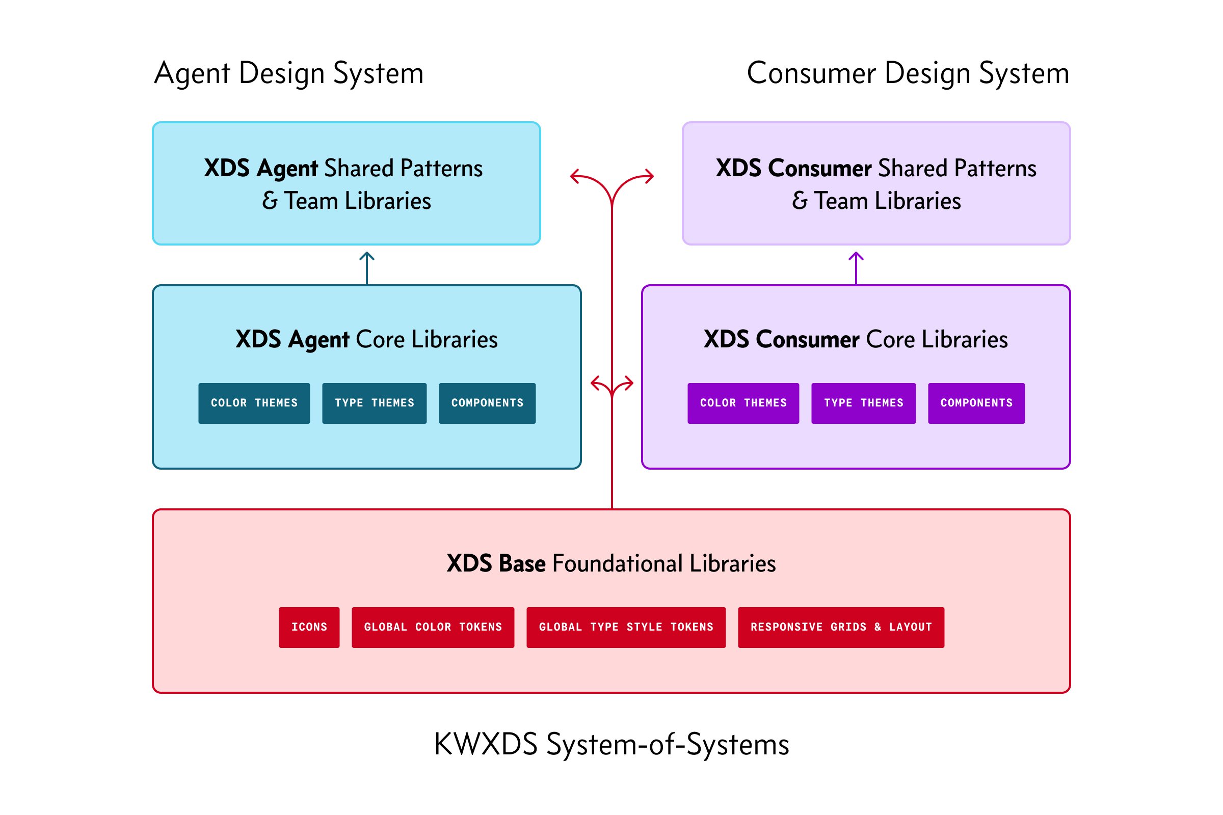
The foundation, XDS Base, contains global color palettes, a global type scale and tokens for text style metrics, a shared icon library, tokens for layout and responsive design, and guidelines for building design systems using the Base.
There are two distinct design systems within KWXDS, known as XDS Agent (for B2B products for KW agents and associates) and XDS Consumer (for B2C products like KW.com and the KW mobile app). Each design system contains themes (including color options and color modes, like light and dark), components, and patterns.
As of 2023, a third design system for brand, marketing, and communication was in development using the same Base foundations.
Color Tokens & Themes
Design tokens are divided between the Base, as global options, and the individual design systems, as theme tokens.
At the Base level, KWXDS provides a comprehensive palette of colors: 192 distinct colors, divided across 10 palettes, each with 19 shades, plus black and white.
Each color palette has 19 shades: 9 “major steps” and 10 “minor steps”. The major/minor scales provide clear default options for colors, while allowing for subtle variation for certain uses. For instance, the color scales allow for creation of subtle gradients by choosing the minor steps surrounding a major step.
The color palettes each use the same perceptual lightness curve from dark to light. This means that equivalent colors across palettes — for example, Red 600 and Purple 600 — will have very similar perceptual lightness, and thus near-equal color contrast ratios with common text and background colors.
This uniform perceptual lightness enables a key feature of KWXDS components: the ability for most components to include a color property that allows the designer or developer to choose a specific color palette for that component.
Color Themes and Color Modes
The global color options in XDS Base are just generic tokens, without meaning. In each design system, the base options are converted into color style themes, a set of tokens for specific applications in the design.
Each design system includes two color mode themes: light mode and dark mode.
The tokens within a theme are divided first into color options, then into categories of use. The color options correspond to the 10 global hues (gray, red, orange, yellow, green, teal, blue, indigo, violet, magenta), plus one or more accent colors for the system. For instance, the Agent design system has one accent color (Teal), while the Consumer design system has two: a primary accent (Gray) and a secondary accent (a Red–Purple gradient). Each of these color options is configurable through a component’s color property, which defaults to the primary accent color.
Each theme color token is categorized by its basic use, and further labeled by state or type. Categories include basic text colors (”label”), backgrounds, lines (”outline”, “divider”), and colors used for interaction, like buttons, links, and all their states, called “action” colors. Color themes also include a special set of tokens for inverted design — in these scenarios, the color mode hasn’t changed, but the application of color is inverted.
Basic Color Token Types
At the highest, and most basic, level, we have color tokens for text (common UI labels and longer-form text) and layout (backgrounds, overlays, outlines, dividers, and shadows). These color tokens remain the same, no matter the color property configured for a component.
Color Options & Action Tokens
The heart of the color system is the color property, tied to subsets of interchangeable color tokens. The “action”-type tokens within each color palette subset handle styling for any interactive element and its states, ensuring strict WCAG AA color contrast compliance. Designers using these tokens, even when building custom components, can be confident that their interactive states will be accessible without the need for additional testing.
The color property allows for greatly-expanded style flexibility within the system, solving one of the key pain points of earlier versions.
Teal is the default accent color used within the Agent design system. Interactive states (hover, focus, pressed) are designed to increase contrast when focused (darkening in light mode, brightening in dark mode), a clearly-visible change in style for the user. The color palettes also include secondary colors, like tinted container backgrounds. Within a color mode, every token uses the same-numbered color option across palettes, making it easy to generate new palettes programmatically — for instance, the action color in light mode is the 600-value of any color.
Red is a common accent color used by the Consumer design system. In this example, another unique capability of the color system is demonstrated — creating subtle gradients from flat colors. The 19-step global color scales allow for any major step to become a gradient by simply using its surrounding minor steps as gradient stops. To configure these components, the color property is configured as “red”, and a special gradient property is set to “true”, selecting a different subset of color tokens from the palette.
Custom accent colors allow designers even more flexibility to extend the look and feel of their design system’s visual style. Throughout the Consumer design system, a red–purple gradient is used as a common accent color, applied to buttons, backgrounds, icons, and more. Creating a complete set of color tokens is simple using the global color scales:
The default action token is a 45º gradient of red600 → purple700
The actionHover token increases each gradient stop by 1: red700 → purple800
Individual tokens can be custom-made, like the actionFocusOutline token, a transparent shade of flat purple700
Typography Tokens & Responsive Design
The typography token system of KWXDS takes a different approach from the color system. XDS Base provides the core type scale and naming conventions for all type styles, and then each design system has a library of type styles with the specific font families for that system applied.
Type styles are created by combining tokens for type metrics: font size, line height, font weight, letter spacing, paragraph spacing, and so on. In the latest version of KWXDS, the type metrics tokens have been simplified down to the essentials:
14 tokens for font size, from extra-small 9pt text to extra-large 96pt text
4 tokens for line height, as a multiplier of font size, covering common UI text and labels, headings, paragraph text, and large editorial titles
Style tokens for each system that allow the designer to tailor the system to their brand’s font family, adjusting attributes like weight or tracking
In addition to type metrics, the KWXDS typography system provides “modifiers” to adjust a type style based on environment or application. The modifier system allows for responsive type styles, and improved rendering of type when set as long-form paragraph text or large, editorial text.
This example demonstrates the text metrics and modifier tokens, using the default “body” text style of the Consumer design system.
At the top are the defaults, using standard tokens — non-responsive text styles.
Next, we add responsive modifiers, and the token name gets a suffix: “Flex”.
Next, we take the three previous sets and add a modifier for long-form text, increasing the line height and adding line-break margins.
Finally, we have special styles for links, adding an underlined style to each set.
I worked very closely with engineers from across our web and mobile-native development teams to design this token system, and this was its third and final evolution. In this version, all font sizes are set in REMs, all line heights are set proportionally, and the base tokens are optimized for use as variables or CSS custom properties. I wrote a demonstration file to explain how a developer could generate a full set of text style classes with just a few lines of code:
Responsive Type Scaling
The original design system (the REAL UI Kit) and the second major version (the Agent design system) provided only fixed-size text style tokens; responsive behaviors were controlled at the component level. This was appropriate for the B2B nature of our Agent platforms, which are much more application-oriented rather than content-heavy.
When the Consumer team began work on the redesign of our consumer platform, they immediately identified the need for responsive text styles; the consumer platform would include many instances of long-form text, large headings and titles, and other areas where text stood on its own as an element, rather than being integrated into a component.
I built responsive scaling into the XDS Base Typography system with two “breakpoint groups” to start: small/medium (mobile, tablet) and large/extra-large (laptop, desktop). The scale adjustment is subtle, an increase of 3pts on average from 9pt–24pt between the two breakpoint groups, with a larger gap for headlines, titles, and display text as the font size increases.
The example above was provided to the team to guide design decisions on when to use responsive vs. fixed-size text styles:
Is the text element going to stand on its own, as part of the layout of the page? Responsive.
Is the text part of a single-purpose component? Non-responsive, and:
Does the component have a scale property with multiple options? Apply responsive behaviors to the component styles.
Responsive Grids & Breakpoints
XDS Base provides a grid system for responsive design and mobile-native app layouts, shared across both design systems.
KW’s products serve a wide range of audiences. Agents using the Command CRM platform are typically working with large amounts of information, like data tables with many columns and rows, and on-screen data density is a priority. A potential client browsing real estate listings on KW.com, on the other hand, may be looking at a single listing with a central column of information and a large gallery of images, and they may more commonly be browsing on their mobile device.
To account for the range of needs and environments, I developed a responsive design breakpoint and grid system with 4 breakpoints and 2 types of grids: fluid and fixed.
Breakpoints use T-shirt size naming (SM, MD, LG, XL), encouraging designers to view these sizes less as specific devices or modes of use (”on the go”, “at my desk”), and more as simply the same interface at different scales. For instance, an agent may be viewing Command on a large 4K desktop monitor, but they may have the window sized to only 1/3 of the monitor width, with additional applications alongside. Now, they’re operating Command at a “medium” size, multitasking with their other tools.
Fluid grids are optimized for dense, data-heavy interfaces — like many parts of the Command platform. In these grids, the columns stretch to fill the available space. Fixed grids set a maximum width for individual columns, and the overall width of the column block is derived from the number of columns. When a page is laid out on a fixed grid, the page will display increasing whitespace along the left and right margins.
I worked closely with designers across several products — our Connect learning platform, our Consumer product, and Command — to identify their layout needs and test versions of the grid and breakpoint system. We landed on an approach for fixed grids where each column would have a minimum width of 60px, and a maximum width of 72px. Larger breakpoints would simply have more columns. The result: when aligning layout modules to the grid, each module had a predictable range of widths. If, for instance, a sidebar spans 4 columns, its width will range from 288px–336px, no matter the breakpoint, improving ease of composition for responsive design.
Finally, to help guide designers making fixed-width mockups in Figma, the grid system library and documentation provides templates and “standard” frame sizes for each breakpoint. All grids are available as Figma library styles.
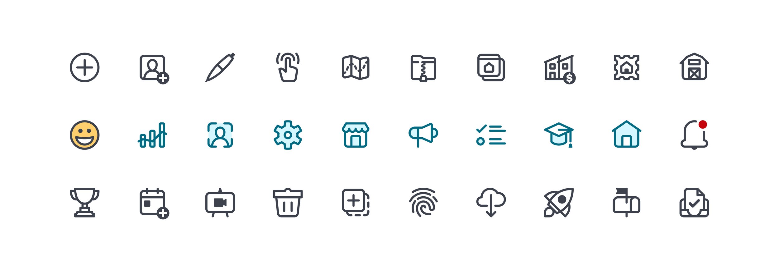
Icons
The KWXDS Icon library contains more than 550 icons, used to represent products, actions, navigation, and more. I drew most of the icons in the library, starting with about 350 in 2020 and adding many others over time.
XDS Icons are drawn on a 32×32 grid with a standard 2pt stroke. In use, icons are scaled to one of three sizes: 32, 24 (default), and 16. Icons come in either single-color or “duotone” varieties, and colors are fully customizable. In production, icons are displayed as inline SVG images using a custom React component that provides configuration, labeling, and styling options.
State of the Icons, 2019
When I joined KW, the design team had several distinct, disjointed icon sets, a result of the rapid and broad product development approach the company had taken to launch Command. Defining the icon language for a particular product was often up to the designer or team behind that product, and many designers put their own spin on our icons and illustrations.
While the look and feel of the icons in use varied widely across the product, there were two general approaches to icon design at the time:
Command used a set of Material-inspired icons: 24×24 with a 2pt stroke, square terminals, chunky shapes, sharp corners. Command also included duotone icons, similar in style to the rest of the set, used for product navigation.
An in-development Consumer platform, and a mobile app companion to Command, used a more “modern” style of icon: 1pt strokes, heavily rounded shapes, round stroke terminals, and no duotone set.
Exploring a Blended Icon Set
A designer on our contractor team expressed an interest in unifying these sets of icons and began exploring how to bring the best aspects of both sets together. They produced four concept sets: 16 icons each, in both single-color and duotone, with four distinct differences:
2pt stroke, 24pt icons
1pt stroke, 24pt icons
2pt stroke, 32pt icons
1pt stroke, 32pt icons
We evaluated these explorations, and the team couldn’t quite agree on the best path forward. The icons drawn at 24×24 with 2pt strokes felt the closest, but a bit too heavy.
Around the same time, I was exploring a blended approach to our UI design language, bringing in the best of both the existing Command visual style and the newer, more divergent Command Mobile/Consumer styles. I created a set of icons using a 1.5pt stroke at 24×24, to illustrate a possible mid-point between the two sets, and this weight was much more well-received.
Returning to the icon explorations, we took the 2pt, 32×32 icons and scaled them down to 24×24, producing a set of icons with 1.5pt strokes. I tested these icons in a mockup UI on a variety of devices and screen resolutions, adjusting the icon design grid to ensure that even on an older standard-resolution screen, the key shapes of an icon would remain legible.
Reviewing these mockups with the team, we decided to move forward with the new style: icons would be drawn at 32×32 using a 2pt stroke weight, and scaled down to 24 or 16 as needed.
Designing the Icon System
To establish design guidelines for the icon system, I explored other popular icon libraries and guidelines, including Google’s Material Icons, Apple’s SF Symbols, and IBM’s Carbon Design System. The Carbon Design System from IBM helped validate our design strategy, using a very similar approach of designing icons at 32×32 using a 2pt stroke and scaling to other sizes.
Based on the design style of the Command Mobile and Consumer icons, I defined the foundational design guidelines for the icon set, including an icon grid with key shapes, corner radii, and guidelines for stroke terminals and intersections.
I began designing new versions of each icon in Figma using the new grid and styles as a guide, adding additional rules as needed to cover design edge cases and ensure a strong foundation for future icon design.
I made sure to include, in the guidelines, scenarios in which it was acceptable to push the rules, and examples of how to do so while remaining true to the spirit of the icon library.
Building the Icon Library
I used Airtable to audit the existing icon sets, matching icons between the sets and identifying their usage and current names. I then defined a new taxonomy for the system; each icon name would include its category, common name, and common variations including filled/outlined styles, circled icons, or duotone icons.
Once the icon inventory was complete, I began drawing the new icon library. For the initial release, I drew about 350 individual icons across 25 different categories; today, there are over 550 icons across 30 categories.
Each icon is drawn in Figma, though some designers choose to draw their paths in another tool before bringing them into Figma for final production. For every icon, the Figma Icon library file presents two versions: the Figma component, containing a single, flattened shape (or two shapes, if the icon is duotone), and a frame containing the raw stroked paths of the icon. In our original Sketch library, icon symbols contained a mess of paths — some with raw strokes, some outlined, sometimes merged into complex shapes, etc. To ensure consistency, only flattened, simplified paths are used in our Figma designs and in our inline SVG files; to promote expansion and growth of the library, raw paths are provided as a starting point for new icon design.
Building the Icon Component
I worked very closely with our engineering team to define how our icons would be used in our product interfaces. The V1 Icon component in the REAL UI Kit was based around an icon font, and required an external service to maintain. This component had several shortcomings: it could not display multicolor icons (these were displayed as inline SVG images using a different component), it was impossible to rename or recategorize icons, and it lacked requirements for accessible labeling and rules for interactivity.
For version 2, we decided to create a component framework that would embed icons as inline SVG images. Our engineering lead developed a script that would take a folder of SVG files and turn them into individual React components; developers could then import whichever icons they needed, or import the whole set. The icon component provided properties for size, color palette, a title string, and more, allowing developers to heavily customize the rendered SVG.
This flexibility was made possible by the close collaboration between design and engineering. I developed guidelines for exporting SVG files from Figma, using layer names to create ID attributes on filled paths in the SVG. The React component used these ID’s to target these paths, allowing multicolored/duotone icons to be styled with different colors, as desired.
Over time, we added more features to the Icon component, including custom sizing, inverted colors, and a special wrapper component that could turn individual icons into an interactive control with proper pseudo classes and accessibility attributes.
Footnote: the links above direct you to older versions of the KW internal design system documentation; they remain publicly accessible as of Summer 2023. If you find that they no longer work, please let me know.
Component and Pattern Libraries
Each design system provides a core Figma component library used by every product designer working within that system, and there are multiple developer libraries for our platforms, including React, Flutter, and React Native.
Components are built to high fidelity with their coded counterparts; properties, options, and capabilities are all designed to match the features of the component in code. Nearly all components are built as Figma variant sets, and all have gone through multiple rounds of upgrades since the spring of 2020 as Figma has expanded and improved their component tools.
The Agent component library contains 170+ components across two dozen component families, like Buttons, Input Fields, Menus, and more. The newer Consumer component library has 140+ components and growing as part of a reimagined Consumer product initiative in 2023.


Component libraries are owned and maintained by the core design systems team, with contributions from designers across the organization. In addition to the “official” component libraries, each team or product line has their own local libraries that they use to expedite their design process, and every designer can contribute to the shared library of design patterns: complex arrangements of components used across products as a standard pattern.
Component Library Evolution
The component libraries within KWXDS went through multiple major revisions and iterations between 2019 and 2023.
The Agent Design System, V1
When I joined KW in 2019, our component library was built in Sketch. Documentation and its style guide lived in InVision, and the React component library had its own documentation site.
the Agent Design System, v2
I began work on Version 2 of the component library in late 2019, in parallel with work on the new design tokens and icons. In the spring of 2020, using the new component and style libraries, I led the migration of our product development organization to Figma.
The initial release of V2, or the Agent design system, included about 80 components; the goal of this release was to reach parity in our Figma libraries with the components present in our legacy Sketch library. The initial release was more than a simple migration; each component and component family was redesigned and upgraded with new design tokens, icons, and new and expanded features over the existing legacy system.
From late 2020 through early 2022 (about 18 months), I managed the development team building the React version of the Agent component library, while also maintaining and upgrading the Figma libraries. Over time, the Figma libraries adopted new features and capabilities, including variant sets, component properties, and improved support for component and design theming.
The Consumer Design System, V1
While work on the Agent design system was in progress, a sibling system was in development for our Consumer platforms. The Consumer product team prioritized product feature work over design system development, which was appropriate for their goals at the time. As a result, the Consumer design system lacked an ownership and maintenance strategy, and the libraries fell behind those of the Agent system in maturity.
The Consumer Design System, V2 + KWXDS Base
In the spring of 2022, the Consumer design team began a major initiative to reimagine our consumer platforms, expanding them to encompass the full homeownership experience rather than just the search and transaction process. While the team explored a brand-new design language in partnership with Razorfish, I began preparing the foundations of a new design system for our Consumer products.
Using the libraries of the Agent design system as a starting point (Colors, Typography, Icons, and Components), I expanded the libraries into a new design system template. I built new libraries for design tokens (color and typography), correcting many of the shortcomings of the existing Agent libraries while providing greater style flexibility to meet the needs of the exploratory designs, including responsive typography, gradient color effects, and additional icons. The existing Agent Icons library became the new XDS Base Icons library, and the 3-breakpoint responsive grid system we’d designed for Command and Connect became the 4-breakpoint XDS Base Grids library.
A Shared Component Architecture
As I began building out the starter component libraries for the Consumer redesign, I pulled Figma components directly from the Agent design system libraries and used these as a starting point. Since the components shared a similar style token architecture, it was simple to update the look and feel of components as I brought them into the new library.
In the summer of 2022, I brought Mike Wilson, a senior product designer, onto the design systems team to lead design of the Agent system while I focused on Consumer. Mike assisted with the buildout of the Consumer library, and we identified components that would benefit from some of Figma’s more recent upgrades.
Mike began a complete rebuild of our Input Field components, one of the most complex components in our system. The original Agent components were built around a single “base component” pattern, a mega-variant-set with over 400 variants. Together, we prototyped a new architecture for Input component sets based on primitive sub-components and more comprehensive, independent parent components. We took turns creating proofs-of-concept, passing the components back and forth and pausing for testing and feedback with members of each product team. Finally, we ended up with a comprehensive set of Input component sets and sub-components for the Consumer design system — and due to the architecture of the theme system, porting these components back to the Agent design system took less than a day of work.

Using an identical component structure but distinct design system theme styling, we can quickly update the look-and-feel of our components as we move them between libraries. Here we have input fields and their primitive sub-components.
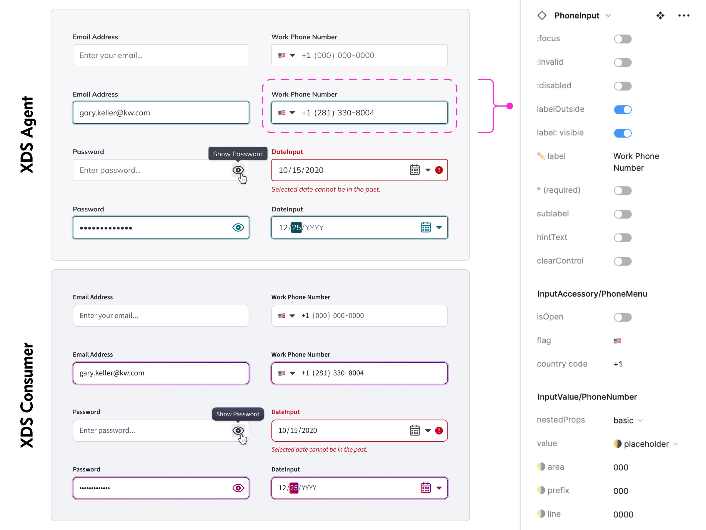
A shared structure ensures that complex components can be implemented quickly in both systems. Here, examples of the same components and configurations in both systems, with a snapshot of the component properties for a typical input field.